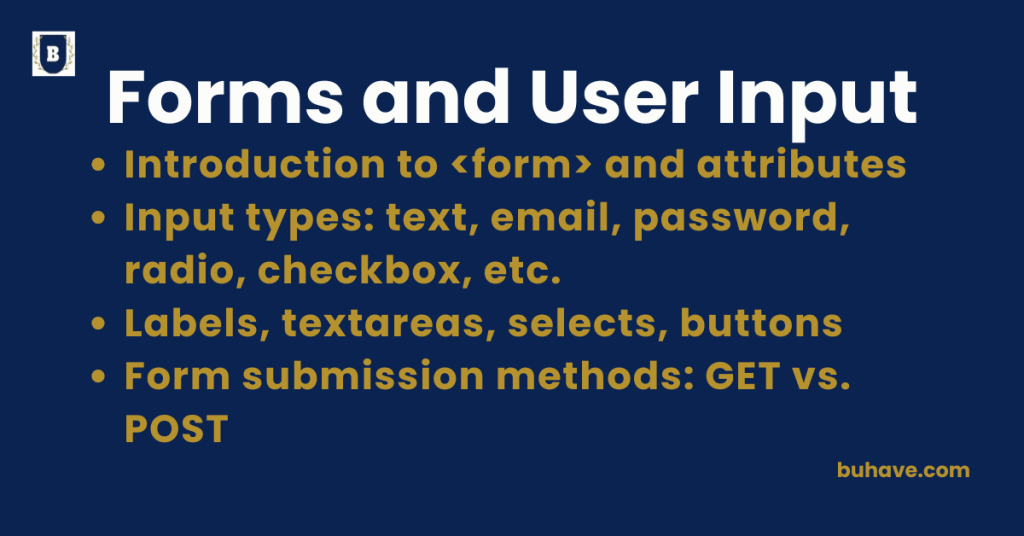
Introduction to <form> and attributes
The <form> element in HTML is used to collect user input and submit data to a server or process it with JavaScript. It’s essential for creating interactive features like login pages, surveys, contact forms, and more. For hands-on ideas on how forms interact with the DOM, explore our DOM Manipulation course.
What is a <form>?
The <form> tag defines an HTML form and acts as a container for different types of input controls: text fields, checkboxes, radio buttons, submit buttons, etc.
Basic Syntax:
<form action=”/submit” method=”POST”>
<input type=”text” name=”username”>
<input type=”submit” value=”Submit”>
</form>
Common <form> Attributes
| Attribute | Description |
|---|---|
| action | URL where the form data is sent (server endpoint). |
| method | HTTP method (GET or POST) used to submit the form. |
| name | Used to identify the form (especially useful in JS). |
| target | Specifies where to display the response (_self, _blank, etc.). |
| autocomplete | Enables/disables browser autofill (on or off). |
| novalidate | Prevents the browser from validating form inputs before submission. |
Example with Attributes:
<form action=”submit.php” method=”POST” target=”_blank” autocomplete=”on”>
<label for=”email”>Email:</label>
<input type=”email” id=”email” name=”email” required>
<input type=”submit” value=”Subscribe”>
</form>
- action: Points to submit.php.
- method: Sends data using POST (hidden from URL).
- target: Opens result in a new tab.
- autocomplete: Enables autofill for inputs.
Quick Notes:
- Use POST when sending sensitive data (like passwords).
- GET is used for search forms or bookmarks (data appears in the URL).
- Combine <form> with proper input elements and validations for robust UX.
For practical form enhancements and JavaScript interactivity examples, see our DOM Manipulation course.
Input types: text, email, password, radio, checkbox, etc.
HTML’s <input> element is used within <form> tags to collect various types of user input. Each type defines a specific behavior, UI, and validation rules.
1. type=”text”
Used for single-line plain text input.
<label for=”name”>Name:</label>
<input type=”text” id=”name” name=”name”>
Accepts letters, numbers, and symbols. See the HTML5 Features course for more on new input types.
2. type=”email”
Accepts email addresses; provides basic validation for format (e.g., @ symbol).
<label for=”email”>Email:</label>
<input type=”email” id=”email” name=”email” required>
Built-in validation, helpful for user experience.
3. type=”password”
Hides user input, used for sensitive info like passwords.
<label for=”pass”>Password:</label>
<input type=”password” id=”pass” name=”password”>
Input is masked (•••••) by default.
4. type=”radio”
Lets users select one option from a set.
<p>Gender:</p>
<input type=”radio” id=”male” name=”gender” value=”male”>
<label for=”male”>Male</label>
<input type=”radio” id=”female” name=”gender” value=”female”>
<label for=”female”>Female</label>
All radios with the same name act as a group.
5. type=”checkbox”
Used to select multiple options independently.
<p>Languages:</p>
<input type=”checkbox” id=”python” name=”lang” value=”Python”>
<label for=”python”>Python</label>
<input type=”checkbox” id=”js” name=”lang” value=”JavaScript”>
<label for=”js”>JavaScript</label>
Each checkbox works independently.
6. type=”date”
Allows users to pick a date from a calendar UI.
<label for=”dob”>Date of Birth:</label>
<input type=”date” id=”dob” name=”dob”>
7. type=”number”
Restricts input to numeric values only.
<label for=”age”>Age:</label>
<input type=”number” id=”age” name=”age” min=”0″ max=”100″>
Supports min, max, and step.
8. type=”file”
Lets users upload files.
<label for=”resume”>Upload Resume:</label>
<input type=”file” id=”resume” name=”resume”>
9. type=”range”
Displays a slider for selecting a number within a range.
<label for=”volume”>Volume:</label>
<input type=”range” id=”volume” name=”volume” min=”0″ max=”100″>
10. type=”submit” & type=”reset”
- submit sends the form data.
- reset clears all fields.
<input type=”submit” value=”Send”>
<input type=”reset” value=”Clear”>
Other Useful Input Types
| Type | Description |
|---|---|
| search | Styled for search fields |
| tel | For phone number inputs |
| url | Validates web addresses |
| color | Color picker |
| hidden | Hidden fields (used in backend work) |
Labels, textareas, selects, buttons
These HTML form elements are crucial for creating user-friendly, accessible, and interactive web forms. Below is a breakdown of each with examples and best practices.
1. <label> – Associating Text with Form Controls
The <label> tag improves accessibility and usability by linking text descriptions to form inputs.
Syntax:
<label for=”username”>Username:</label>
<input type=”text” id=”username” name=”username”>
- The for attribute must match the input’s id.
- Clicking the label focuses the input.
For broader accessibility and navigation practices, see Hyperlinks and Navigation.
2. <textarea> – Multi-line Text Input
Used for collecting long-form input like messages or descriptions.
Syntax:
<label for=”message”>Message:</label><br>
<textarea id=”message” name=”message” rows=”5″ cols=”40″>Enter your message here…</textarea>
Attributes:
- rows: Number of visible text lines.
- cols: Width of the textarea.
- Can include placeholder/default text between opening and closing tags.
3. <select> – Dropdown Menus
Creates a dropdown list from which a user can select one or more options.
Syntax:
<label for=”country”>Choose Country:</label>
<select id=”country” name=”country”>
<option value=”us”>USA</option>
<option value=”ca”>Canada</option>
<option value=”uk”>UK</option>
</select>
Optional Attributes:
- multiple: Allows selection of multiple options.
- size: Number of visible options before scrolling.
4. <button> – Clickable Button
Can be used to submit, reset, or trigger JavaScript actions.
Syntax:
<button type=”submit”>Submit</button>
<button type=”reset”>Clear</button>
<button type=”button” onclick=”alert(‘Clicked!’)”>Click Me</button>
Types:
- submit: Submits the form.
- reset: Resets form fields to default values.
- button: Does nothing by default; used with JS.
Pro Tips:
- Always pair inputs with <label> for accessibility (screen readers).
- Use textarea for longer user input like feedback or posts.
- Use <select> when users must choose from predefined options.
- Use <button> for actions and interactions beyond form submission.
For broader accessibility and navigation practices, see Hyperlinks and Navigation.
Form submission methods: GET vs. POST
In HTML, the <form> tag uses the method attribute to define how form data is sent to a server. The two primary methods are GET and POST, and each serves different purposes with distinct characteristics.
method=”GET”
Sends form data appended to the URL as query parameters.
Example URL:
- https://example.com/search?query=python
Use Cases:
- Search forms
- Bookmarkable or shareable results
- Non-sensitive data
Characteristics:
| Feature | GET |
|---|---|
| Data visible in URL | Yes |
| Data length limit | Yes (URL limit ~2000 chars) |
| Caching allowed | Yes |
| Bookmarkable | Yes |
| Secure for sensitive data | No |
| Default form method | Yes |
Example:
<form action=”/search” method=”GET”>
<input type=”text” name=”query”>
<input type=”submit” value=”Search”>
</form>
method=”POST”
- Sends form data in the body of the HTTP request.
- The URL stays clean and does not expose form values.
Use Cases:
- Login forms
- Registration forms
- File uploads
- Sensitive or large data
Characteristics:
| Feature | POST |
|---|---|
| Data visible in URL | No |
| Data length limit | Very high |
| Caching allowed | No |
| Bookmarkable | No |
| Secure for sensitive data | Yes (with HTTPS) |
| Default method | No (must specify) |
Example:
<form action=”/submit-form” method=”POST”>
<input type=”text” name=”name”>
<input type=”email” name=”email”>
<input type=”submit” value=”Submit”>
</form>
Summary Table:
| Feature | GET | POST |
|---|---|---|
| Data in URL | Yes | No |
| Use for sensitive data | No | Yes |
| Bookmarkable | Yes | No |
| Caching | Yes | No |
| Max data size | Limited (URL length) | Large |
| Default method | Yes | No (must specify) |
Pro Tip: Always use POST when handling sensitive data like passwords, personal info, or uploading files, especially when using HTTPS for secure transmission.