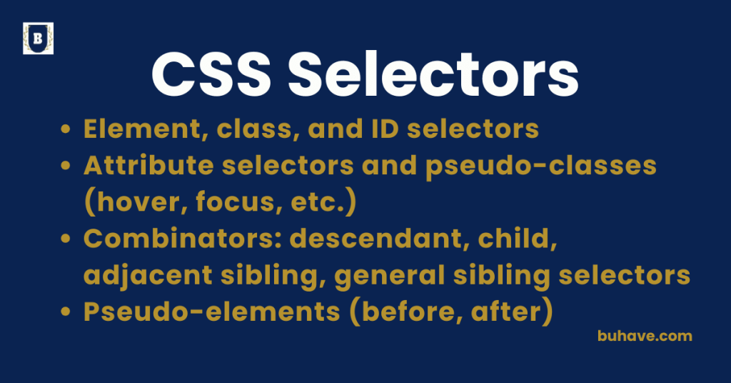
Element, Class, and ID Selectors
In CSS, selectors are patterns used to target specific HTML elements for styling. Introduction to CSS course provides foundational context.
Three of the most common types of selectors are element selectors, class selectors, and ID selectors.
Understanding how they work is essential for controlling which elements get styled and how.
1. Element Selector
Definition:
The element selector targets HTML elements directly by their tag name (like h1, p, div, section, etc.).
Syntax:
element-name {
property: value;
}
Example:
p {
color: blue;
font-size: 18px;
}
- This will apply the styles to all <p> elements in the HTML document.
Use When:
You want to apply styles uniformly to every instance of an HTML tag.
Tip: When you start combining selectors, refer to Basic CSS Properties to see how individual declarations are defined and applied.
2. Class Selector
Definition:
A class selector targets one or more elements based on a class attribute.
Classes are reusable and can be applied to multiple elements.
Syntax:
.class-name {
property: value;
}
- Always start the selector with a dot (.) before the class name.
Example:
.button {
background-color: green;
color: white;
padding: 10px 20px;
border-radius: 5px;
}
HTML:
<button class=”button”>Submit</button>
<a href=”#” class=”button”>Learn More</a>
- Both the <button> and <a> elements will share the same styling because they both have the class button.
Use When:
You want multiple elements to share the same style without affecting unrelated elements.
For more on text and formatting of elements like buttons and links, see Text and Formatting Elements.
3. ID Selector
Definition:
An ID selector targets a single, unique element based on its id attribute.
An ID must be unique across the entire HTML document (should not be reused).
Syntax:
#id-name {
property: value;
}
- Always start with a hash (#) before the ID name.
Example:
#header {
background-color: navy;
color: white;
text-align: center;
}
HTML:
<header id=”header”>
Welcome to My Site
</header>
- Only the <header> with the ID header will receive these styles.
Use When:
You want to style a unique, single element separately from others.
Selector Priority (Specificity)
- ID selectors have the highest priority (specificity).
- Class selectors have medium priority.
- Element selectors have the lowest priority.
Example: If the same element is targeted by an element selector, a class, and an ID, the ID selector’s styles will apply.
p {
color: black; /* Low priority */
}
.text {
color: blue; /* Medium priority */
}
#special {
color: red; /* High priority */
}
HTML:
<p id=”special” class=”text”>Hello World</p>
- The text will be red because the ID selector #special wins.
Comparison Table:
| Selector Type | Syntax | Targets | Reusability | Specificity |
|---|---|---|---|---|
| Element | p {} | All <p> tags | All elements | Low |
| Class | .class {} | Any element with class | Many elements | Medium |
| ID | #id {} | Only the unique ID | Single element | High |
Summary:
- Element selectors apply styles to all instances of a tag.
- Class selectors apply styles to any elements sharing the same class.
- ID selectors apply styles to one unique element only.
Understanding and properly using selectors helps you build cleaner, organized, and scalable CSS for your web projects.
Attribute selectors and pseudo-classes (hover, focus, etc.)
CSS offers powerful ways to target elements based on their attributes or user interactions without needing extra classes or IDs.
Two essential features for this are attribute selectors and pseudo-classes like :hover, :focus, and many others.
Mastering these tools makes your styles more dynamic, flexible, and user-friendly.
1. Attribute Selectors
Definition:
Attribute selectors target HTML elements based on the presence or value of their attributes (such as href, src, alt, type, etc.).
Syntax:
element[attribute] {
property: value;
}
element[attribute=”value”] {
property: value;
}
Types of Attribute Selectors:
| Syntax | Meaning |
|---|---|
[attr] |
Selects elements with the attribute |
[attr="value"] |
Selects elements with an exact value |
[attr~="value"] |
Value in a space-separated list (one word match) |
[attr^="value"] |
Value starts with specified string |
[attr$="value"] |
Value ends with specified string |
[attr*="value"] |
Value contains specified string |
Examples:
1. Select all links (<a>) with an href attribute:
a[href] {
color: blue;
}
2. Select only links to external websites:
a[href^=”http”] {
color: green;
}
- Targets links where href starts with “http”.
3. Select input fields of type “email”:
input[type=”email”] {
border: 2px solid blue;
}
4. Select images with alt text containing “logo”:
img[alt*=”logo”] {
border: 1px solid gray;
}
Best Practice:
Use attribute selectors when you want to style elements based on their function or purpose, without adding extra classes or IDs.
2. Pseudo-Classes
Definition:
Pseudo-classes define a special state of an element.
They allow you to style elements based on user interaction (like hover or focus), their position in the document, or other characteristics.
Syntax:
selector:pseudo-class {
property: value;
}
Common Pseudo-Classes:
| Pseudo-Class | Meaning |
|---|---|
:hover |
When the user hovers over an element |
:focus |
When an element gains focus (e.g., input box) |
:active |
When an element is being clicked |
:visited |
A link that has already been visited |
:first-child |
Selects the first child of a parent |
:last-child |
Selects the last child of a parent |
:nth-child(n) |
Selects the nth child of a parent |
Examples:
1. Change button color on hover:
button:hover {
background-color: orange;
color: white;
}
2. Highlight an input when it is focused:
input:focus {
border-color: green;
outline: none;
}
3. Style the first list item differently:
ul li:first-child {
font-weight: bold;
}
4. Style every odd row in a table:
tr:nth-child(odd) {
background-color: #f9f9f9;
}
Best Practice:
Use pseudo-classes to create interactive and intuitive experiences without needing JavaScript for simple UI feedback.
Combining Attribute Selectors and Pseudo-Classes
You can combine them for advanced, precise styling:
Example: Highlight external links when hovered:
a[href^=”http”]:hover {
text-decoration: underline;
color: red;
}
- Only external links (href starts with “http”) will change style when hovered.
Summary:
| Feature | Purpose |
|---|---|
| Attribute Selectors | Style elements based on their attributes |
| Pseudo-Classes | Style elements based on user interaction or structure |
Conclusion:
Attribute selectors and pseudo-classes are key tools for writing smart, dynamic CSS.
They help you style based on context, behavior, and user action, creating more flexible and responsive designs — without cluttering your HTML with extra classes. For accessibility considerations and modern best practices, see Best Practices and Optimization.
Combinators: descendant, child, adjacent sibling, general sibling selectors
In CSS, combinators allow you to select elements based on the relationships between HTML elements.
Instead of targeting elements individually, combinators let you style elements based on their position relative to other elements.
There are four main types of combinators:
1. Descendant Selector (space)
Definition:
The descendant selector selects any element that is inside another element, no matter how deeply nested.
Syntax:
parent descendant {
property: value;
}
Example:
div p {
color: blue;
}
- This selects all <p> elements that are inside a <div>, whether directly or deeply nested.
HTML Example:
<div>
<p>Paragraph 1</p>
<section>
<p>Paragraph 2</p>
</section>
</div>
- Both paragraphs will be styled because they are inside the div.
Use When:
- You want to target all descendants of an element, regardless of how deep.
2. Child Selector (>)
Definition:
The child selector selects only direct children of a specified element.
Syntax:
parent > child {
property: value;
}
Example:
ul > li {
list-style-type: square;
}
- This selects only <li> elements that are direct children of the <ul>.
HTML Example:
<ul>
<li>Item 1</li> <!– styled –>
<div>
<li>Item 2</li> <!– styled –>
- Only the direct child <li> elements of the <ul> will receive the styles.